Web app
SaaS
Redesign
FinTech
Archdesk - managing all business aspects in single SaaS platform
Archdesk is a modular based software that allows business owners and workers to operate complicated company processes, ie. Invoicing, CRM or Scheduling. The challenge was to reshape the application and work closely with developers to establish brand style, design system and new visuals.
Date
approx. 4 years
Role
In-house UI/UX Designer
Deliverables
Design System, UI designs, Prototypes, Landing Pages, In-depth Interviews
Tools
Figma, Zoom, Adobe Photoshop
Overview
When I joined the Archdesk team, the web platform did not have a design system and was composed of material design and IOS components styled by the developers. The system lacked visual consistency, branding and looked outdated. Archdesk formed a DUX (Design & User Experience Team) which consisted of the Design & UX Head - Ilona, and myself. Together we embarked on a journey close to improssible, to redesign the beast of the system that is Archdesk. Our main aim was to make Archdesk more intuitive, faster and to listen to the clients.
We redesigned several already existing modules, as well as introduced a few new features, requested by the users. In this case study, 2 redesigned modules and 1 new module will be shown.
Results
In the 4 years, we made a huge positive impact on how the system was perceived by the users. Most users declared the system is more intuitive and faster to use.
90%
faster Time-to-Interaction, the system responses felt instant
64%
(9/14) of interviewed users declared Archdesk guarantees better data flow
80%
(4/5) of interviewed users declared Archdesk has positive user experience
Problems
We identified 3 main problems with the exitising SaaS web system.
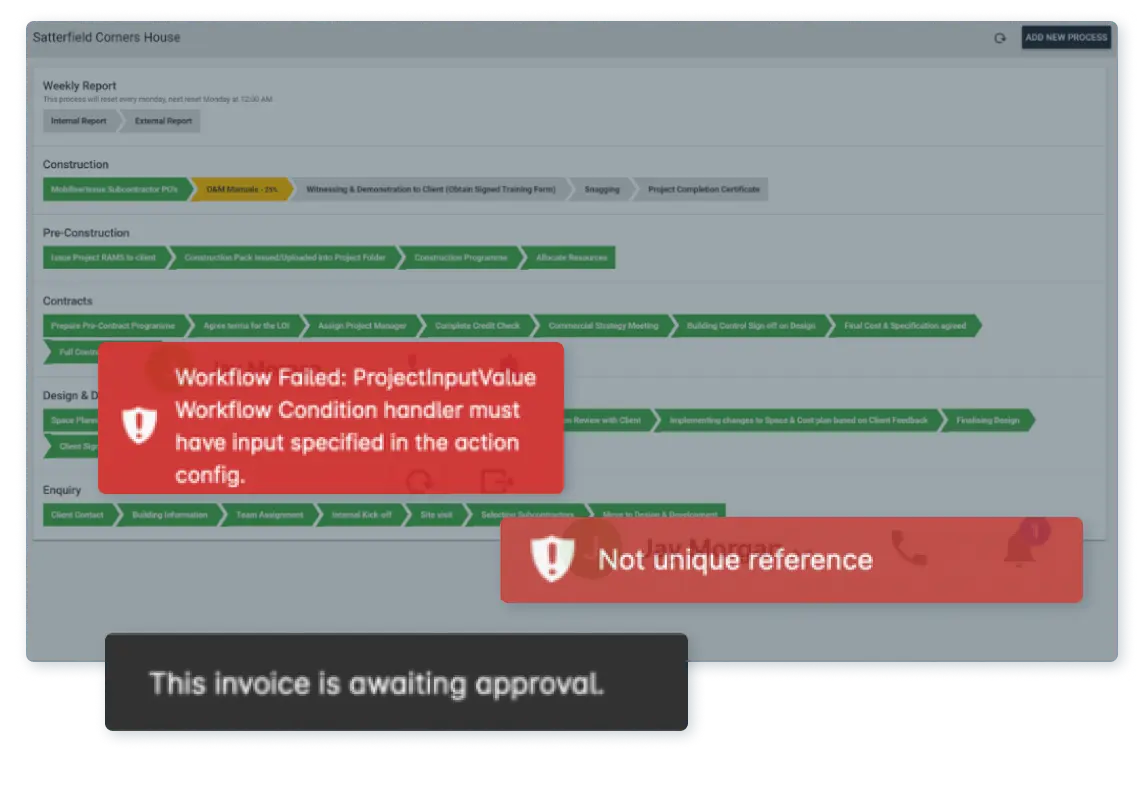
Inconsistent
Inconsistent designs for similar functions left users confused and frustrated, often unsure of what to click or where to look. This not only caused disorientation but also made Archdesk feel less professional and trustworthy.
Outdated
Outdated design elements made the system feel clunky and unappealing, lacking the modern polish users expect from a professional platform. This not only impacted usability but also left users questioning its reliability.
Slow
Slow loading times for pages and tables left users waiting, disrupting their workflow and making the system feel inefficient. This significantly impacted the overall user experience and satisfaction.
Goals
We converted the problems into opportunities to solve during redesigns and designs of upcoming new features.
Inconsistent Consistent
By building a unified design system with reusable components and collaborating closely with developers, we will ensure consistency across the platform. This will create a more intuitive and visually cohesive experience, boosting user confidence and enabling them to navigate and complete tasks effortlessly.
Outdated Modern
By redesigning layouts to be simpler and less cluttered, incorporating more white space for better readability, and using accent colors to guide user focus, we will create a modern and visually appealing interface. This will enhance usability, reduce cognitive load, and provide a more enjoyable experience for our users.
Slow Fast
By upgrading to the latest Angular framework, collaborating with developers to optimize performance, and utilizing ready-made components, we will significantly reduce loading times. Identifying and addressing key areas for improvement will ensure a faster, smoother experience, allowing users to work efficiently without delays.
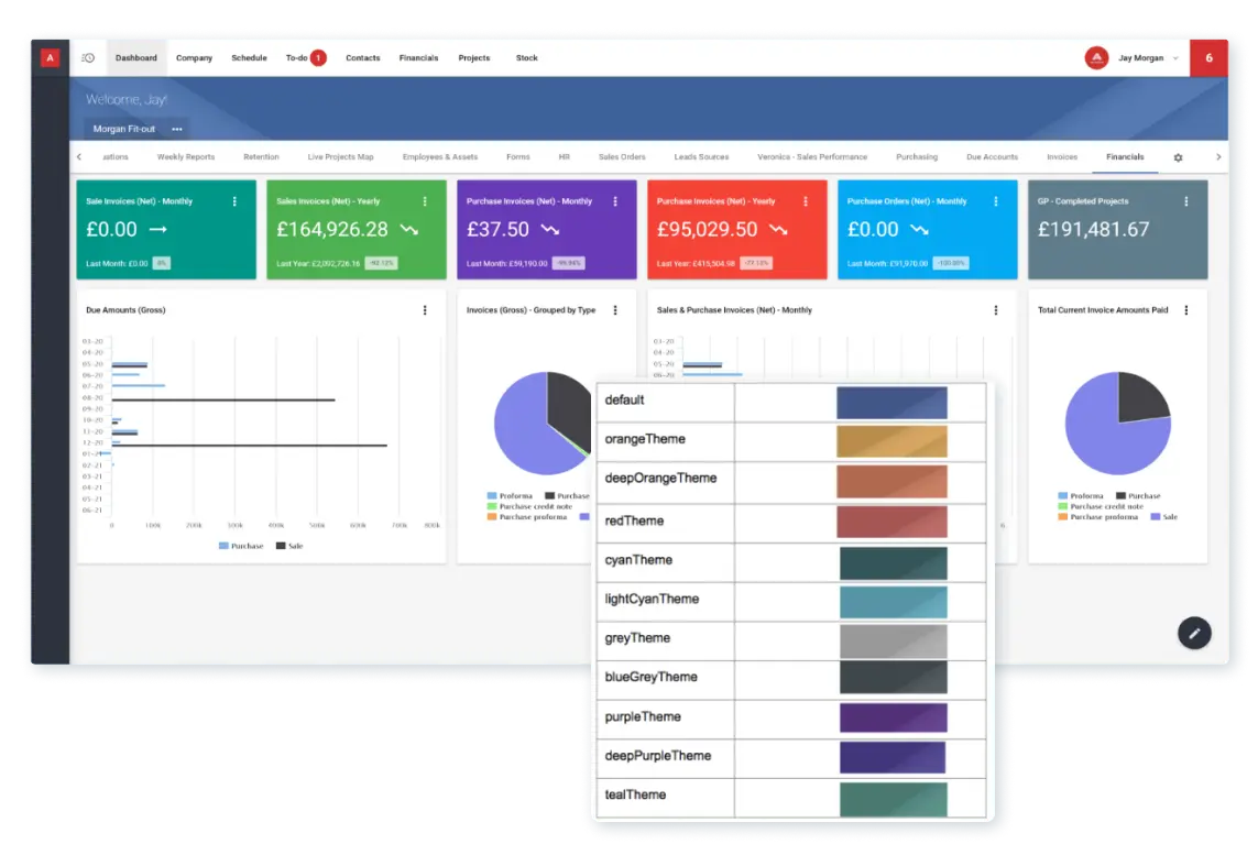
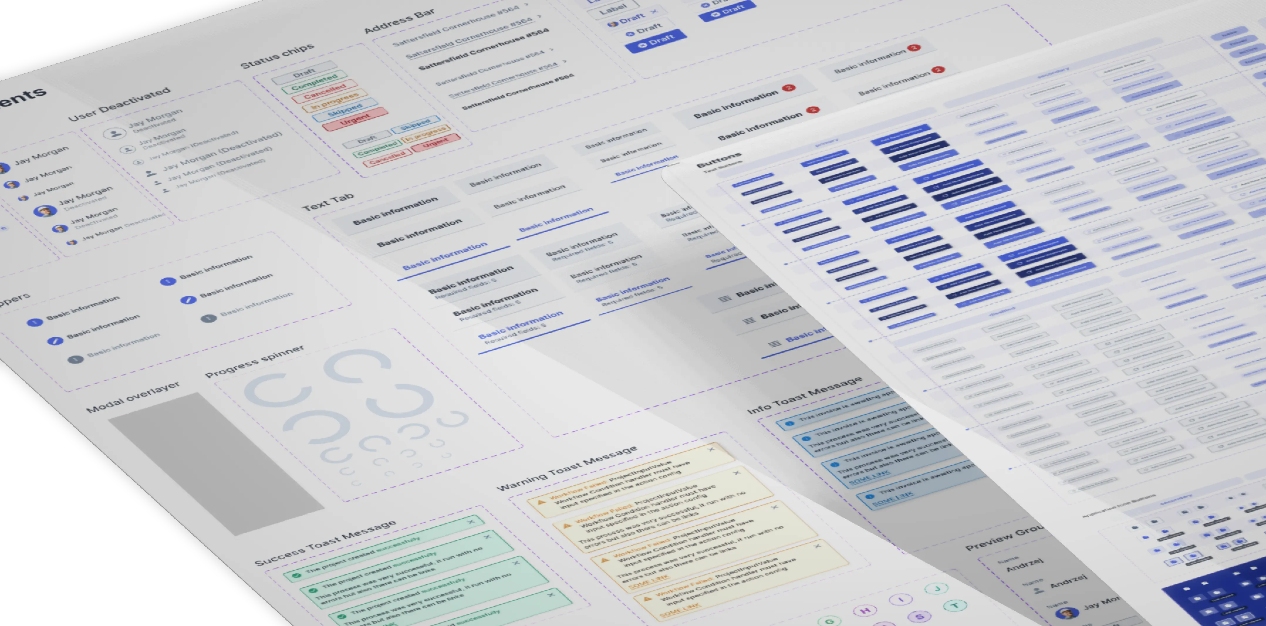
Archdesk Design system
The backbone for all our designs and redesigns consisted of creating a design system. The extensive components allowed us to work with developers on achieving more intuitive layouts.
Redesign
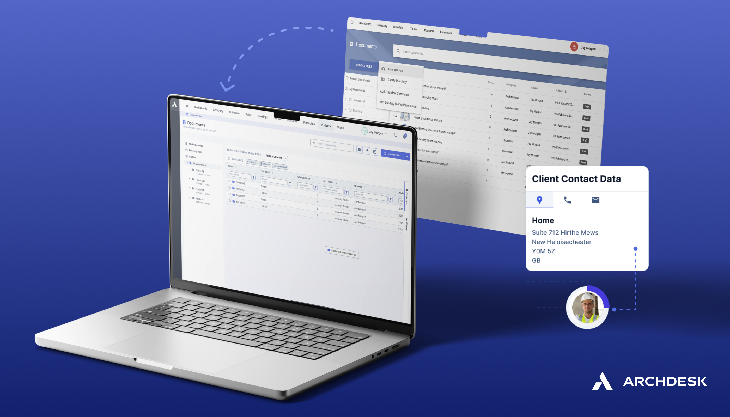
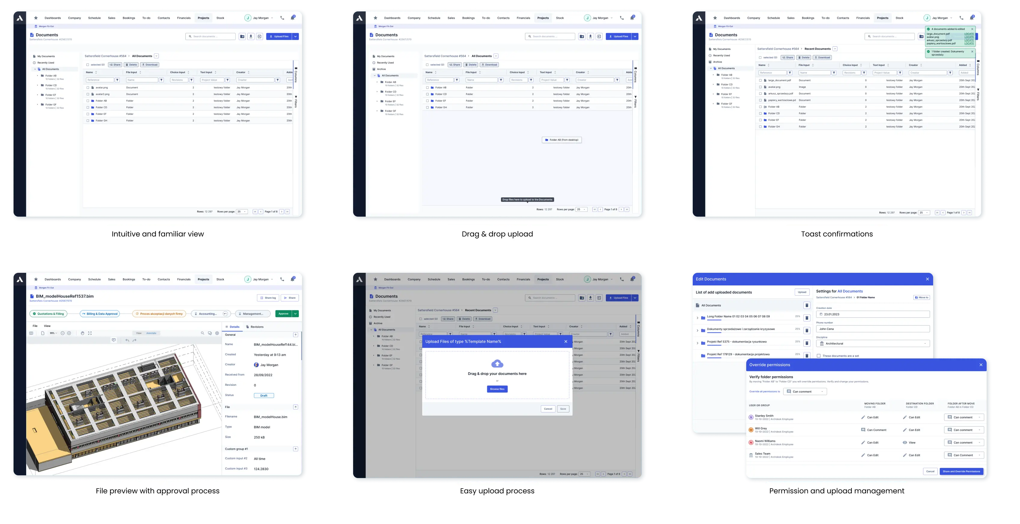
Document Management System (DMS)
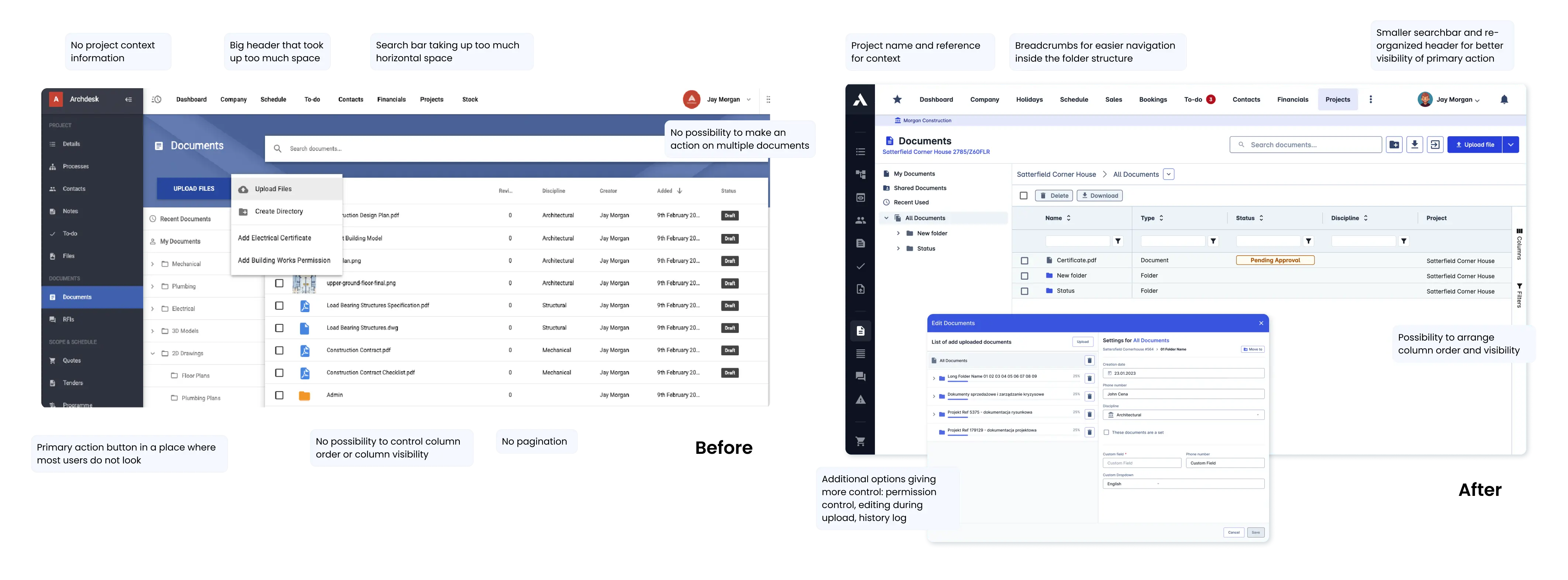
Document Management System module in Archdesk was not heavily used by the users, because the users pointed out they either do not feel the need to store documents in Archdesk system, as they are using a third-party software, or the DMS is lacking in functionalities, ie. bulk actions or drag and drop. Our goal during this redesign was to make the DMS module usable, intuivie and visually similar to softwares that the users were familiar with ie. Sharepoint.
Improved functionalities
To the new DMS design, we introduced:
- Drag & drop upload - faster and more intuitive upload;
- Breadcrumbs - better navigation in folder structures;
- Bulk actions - change multiple files at once;
- History log - track changes and approvals of the file;
- Share permissions - view, grant or revoke access to the file.
Old vs New Design
User Interviews
After the designs were ready, we performed a series of In-depth interviews (IDIs) with Archdesk users to ensure the layouts were understandable and intuitive. We separated 2 main usability tasks:
- Drag & drop - change the position of the folder, by drag & drop on another folder - was completed by 4/5 users (80%)
- Upload a new file - upload and fill information about a new file - was completed by 4/5 users (80%).
Share permission layer and new visuals were perceived positively. The designs were partially implemented soon after the IDIs and DMS is one of the most used modules in the system currently.
100%
of users said the new visuals looked familiar, which was what we aimed for
~94 users
monthly, using the DMS Archdesk module
80%
(4/5) of interviewed users performed both usability task, indicating the module is intuitive
Redesign
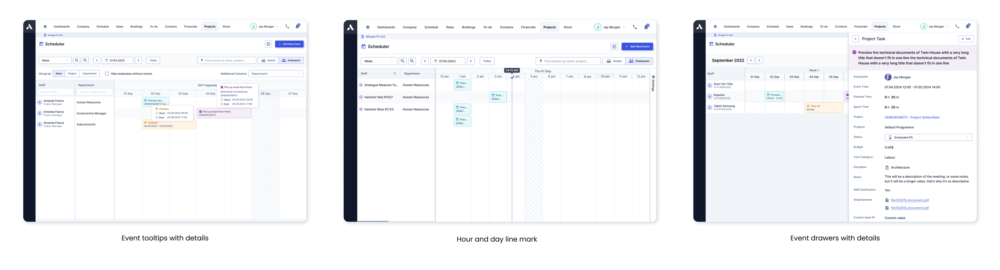
Scheduler
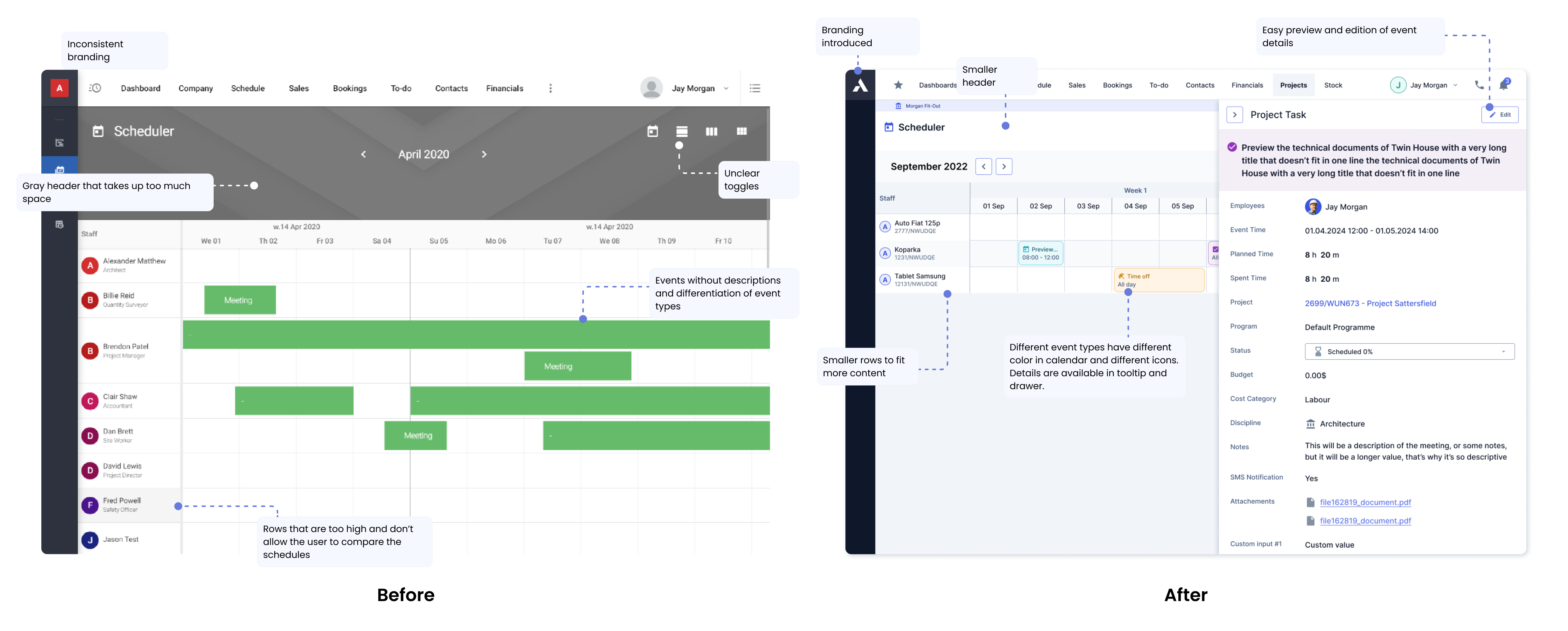
Scheduler is a module in Archdesk that allows to see events for each user. This module is tightly connected to Programme of Works, because it allows the user to see Project Tasks for employees. In Scheduler, the user can see 4 types of events: Project Task, Time off, Meeting and Holiday.
Improved functionalities
To the new Scheduler design, we introduced:
- Event drawers - opened on top of the calendar, does not disturb the user's workflow and allows to quickly check and edit event details;
- Color & icon coded event types - better readability of the calendar at a glance, icons guarantee accessibilty for color-blind;
- Clear toggle - switch between Assets and Employees with a clear toggle;
- Event tooltips - quickly check necessary event details on hover, reduce number of clicks;
- Hour/day line - marking present time or day on the calendar;
- Improved visuals & branding - consistent with Archdesk DS, more white space and better navigation.
Old vs New Design
Results
The redesigned Scheduler was initially introduced as a Beta feature alongside the old module. Its high adoption rate enabled us to fully transition to the new version, allowing us to disable the old module entirely. This not only reduced system loading times but also provided users with a faster, more efficient tool that received overwhelmingly positive feedback.
~90%
adoption rate of the re-designed Scheduler module
~350 users
monthly, using the Scheduler module
~1000
events created monthly by the users
New module
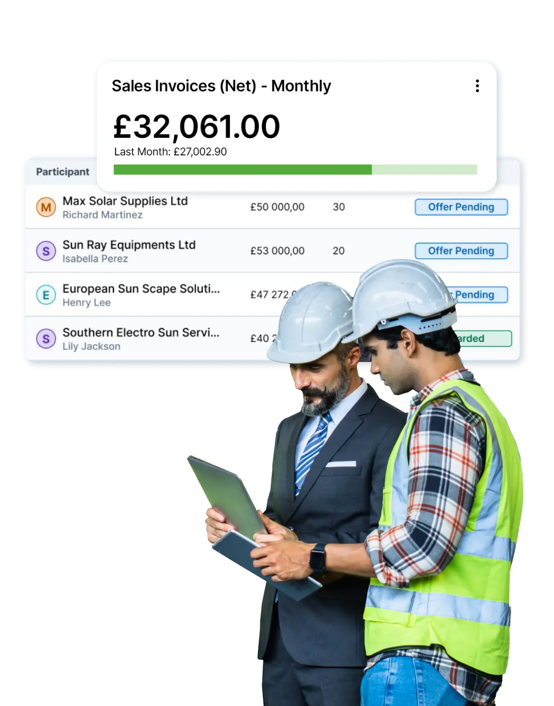
Tender Awardees
Tendering process is one of the most beneficials to the system users. It allows the user to manage their tenders by adding participants, sending out e-mail invitations, receiving and comparing offers, helps the user evaulate and choose the winners.
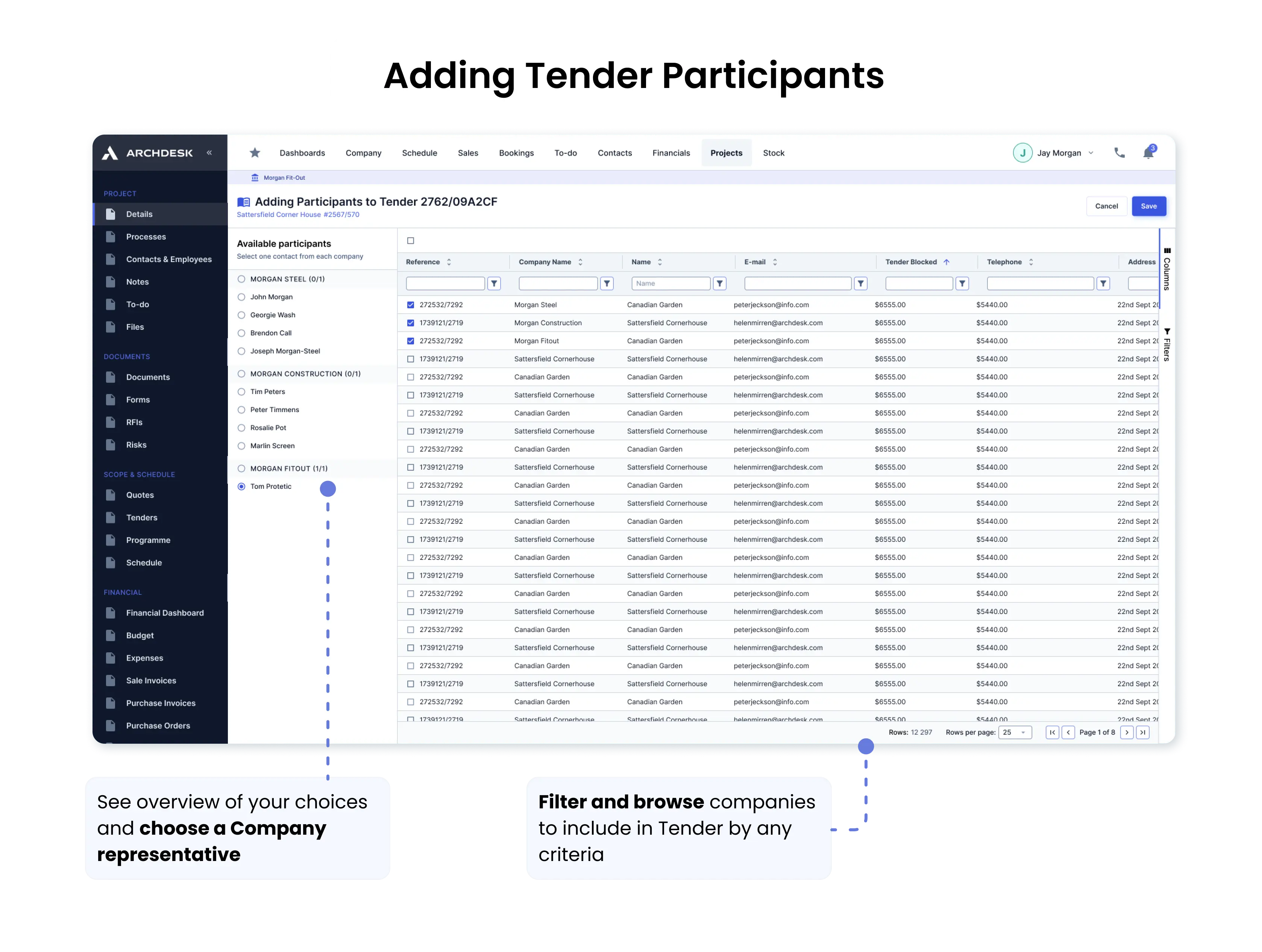
Add Tender Participant
The first page we addressed was the process of adding a tender participant. The business requirement was clear: a tender participant represented a company, but each company often had multiple contacts (representatives) associated with it. To ensure seamless communication, only one contact could be assigned to the tender. This required designing a page that allowed for selecting multiple companies while enabling single-contact selection for each, which initially presented a significant challenge.
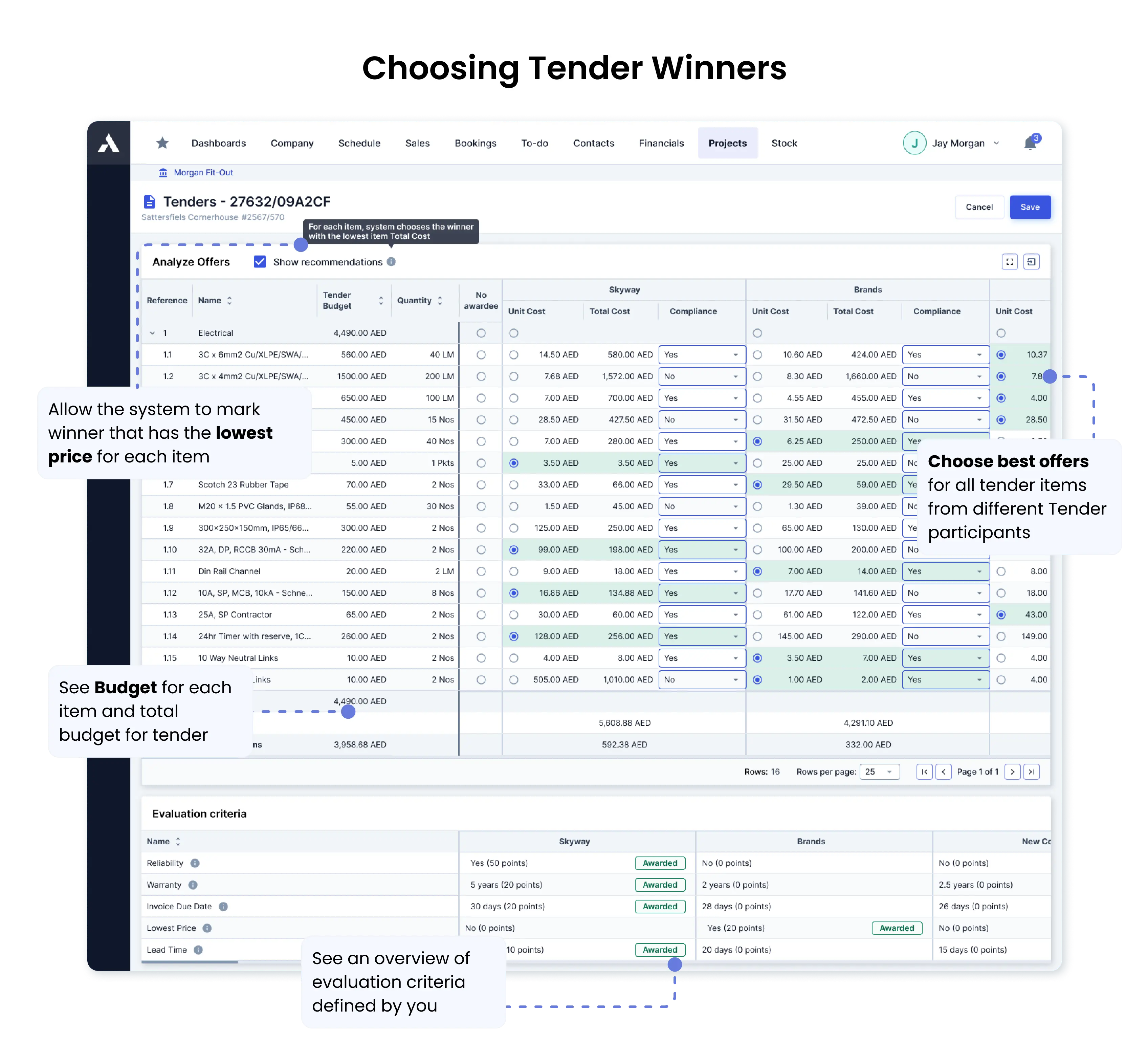
Choose Tender Winner
After adding the tender participant feature, we aimed to provide Archdesk users with the ability to compare offers from different companies. Each tender could include multiple items, and the key objective was to allow users to mix and match offers for individual itemsto achieve the best overall value. To make the process faster, we introduced an option toautomatically select the lowest-priced offer for each item, aligning with the most commonly used user criteria.
Results
The new and improved Tendering process received overwhelmingly positive feedback from Archdesk clients and became a valuable asset in securing new deals. Usage of the feature steadily increased from the day of its release. To enhance client awareness, we also prepared a Newsletter and Changelog to accompany the launch of this feature.
~881 users
monthly, adding new tender participant
~517 users
monthly, comparing offers from tender participants
~120 users
monthly, choosing tender winners for items
Other modules & projects
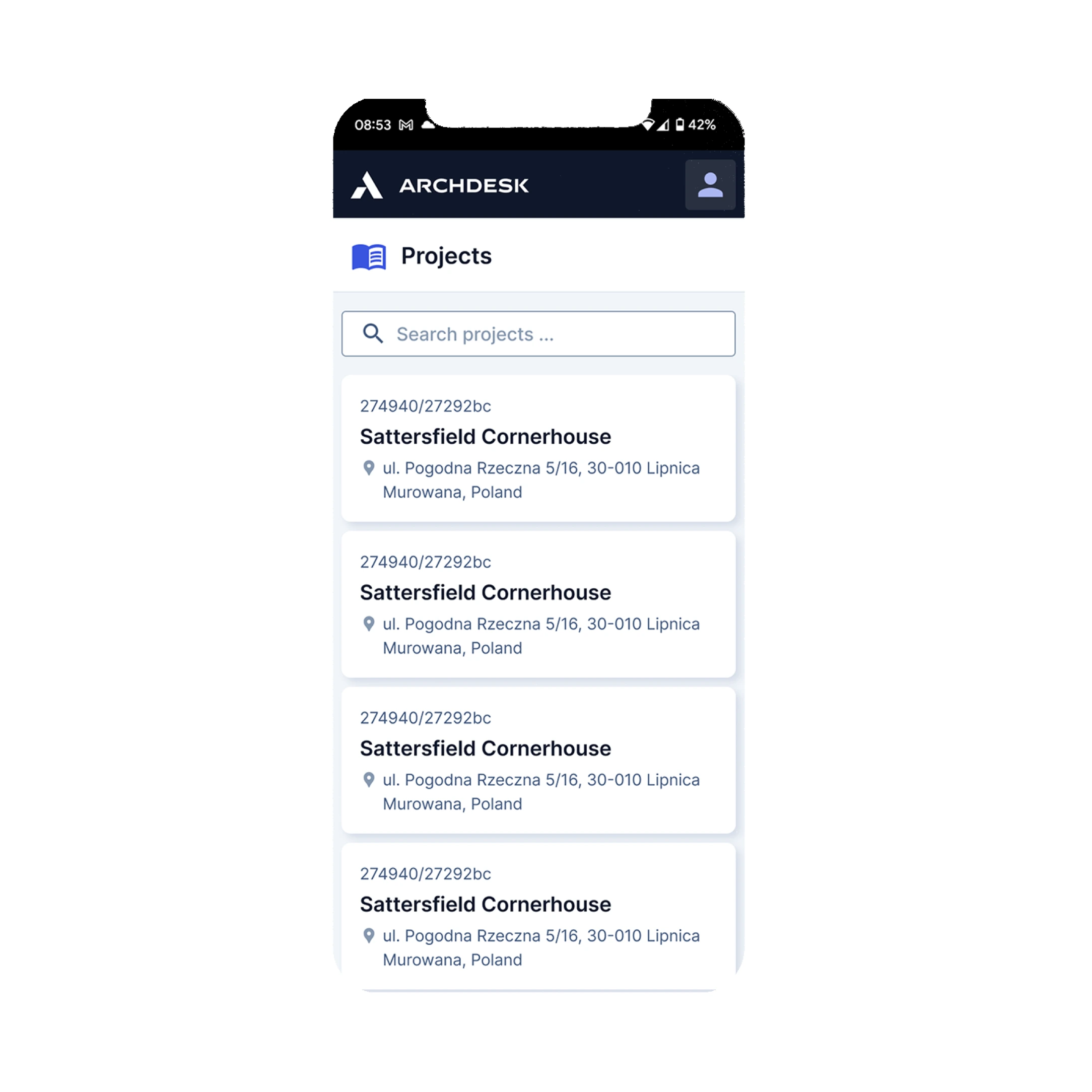
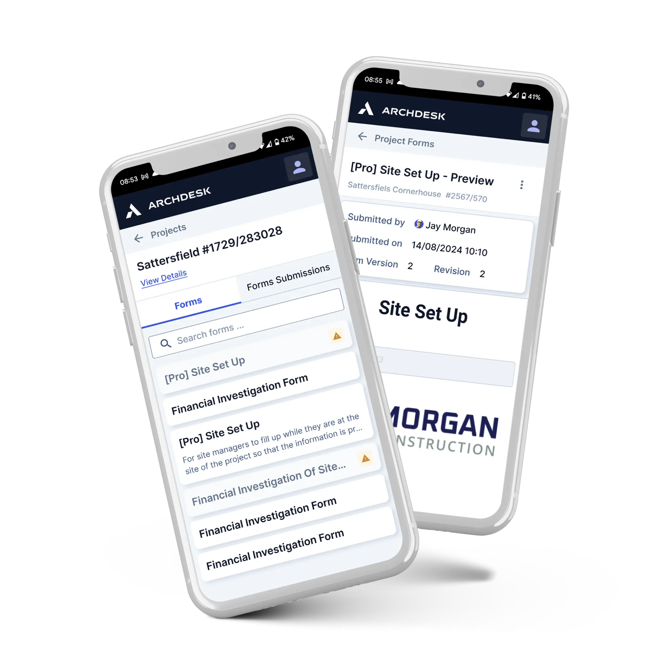
During my time at Archdesk, we redesigned numerous system elements to make the platform more user-friendly and intuitive. While clients appreciated Archdesk for its modularity and flexibility, the system's complexity occasionally posed challenges for less tech-savvy users. To address this, we sometimes opted to limit functionalities. For example, in the mobile application, only selected modules are available, simplifying use for on-site construction workers. We also prioritized large tap areas to ensure the app could be easily used, even while wearing gloves.
Some other examples of redesigned modules are Dashboards and Processes.
Mobile Application